1. The Saatchi gallery was definitely the most accessible museum yet in terms of viewing all angles of the objects. I feel this is necessary for this type of gallery because of the uniqueness of the objects. A lot of them are not merely 2 dimensional works of art, but are 3 dimensional objects that require multiple views in order to be fully appreciated. There was also space provided for each individual painting which was beneficial to viewing as well. This was definitely different from the crowded walls or large, ornate frames of previous museums.
2. The Saatchi gallery had an interesting approach to captioning their work. Where most museums would provide a little information about the artist and the meaning of the work, this gallery merely provided a small label for the piece. The tour guide explained to us that this is because the gallery wants viewers to interpret the works for themselves, and I believe with the type of artwork they display, this is a very efficient method. However, I really enjoyed hearing about how the artwork was obtained and placed in the gallery, and I think this could make a great addition to the small labels placed with each work of art. Because the artwork is so unique, I feel it would be interesting to viewers to know who created it and how Mr. Saatchi came up on it.
3. I really enjoyed the modern, creative works of art this gallery contained. I felt the art was much deeper and more meaningful than some works of art I saw in other museums (though I know this feeling is totally subjective). I felt there was a real presence behind the works, and they were very thought provoking. Though the tour guide explained some of the works to us, I was able to look at a few on my own and come to my own conclusions as to what the artist was trying to get at the work of art; I am not always able to do this when observing pieces of modern art. I truly enjoyed Mr. Saatchi's collection and I would love to have a chance to meet him and try to understand why he picks the pieces he does.
Tuesday, 29 March 2011

Monday, 28 March 2011
Wall Art
 |
| This photo was taken on my visit to the East End of London. It's really a shame that this mural hasn't been kept in better contact. You can tell that it's really faded and it looks like a few hoodlums have marked over it a bit. That being said this is a very strong piece to me. I think it's works like this that seperate the labels of "graffiti" and "wall art" There's passion in this work and so many lines. It really delivers a message to the viewer rather than just reps a name. Also sometimes black on white is as bold as you can get. |
 |
| This photo was another taken on my East End walk. The only thing that really pops into my head when I look back at this picture is blah. It seems that multiple people have put little scribbles on it and the paint is practically all chipped away. Accompanied by poor management one can't even comprehend what this wall is supposed to say or look like. I would not be happy if when my city gets brought up this is an image that pops into outsiders minds. |
 |
| This photo was taken at the train station I visited in Copenhagen, Denmark. I have to give it to the artists on this one. Their lines are on point, there are few to no mistakes and it seems in all it was well put together. But I feel you have to dig a little deeper than that. Notice how I said I took this photo in Denmark. This type of graffiti is so common. I could get 500 shots of this same shit in London, back home in the states, as well as hundreds of other countries. Also, if I were an artist of this type, an important roll that played into my works would be geographics. This mural is done on the side wall at a run down train station. This is where people will stop looking at it as art and start looking at it as vandalism. I don't know about the artists but I'd pick the first. |
 |
| This wall art was some I found in the dorms of my friend's university in Aarhus, Denmark. This is so cool. How many university dorms are old and boring with plain white walls? If I walked into my dorm everyday and got to view great art lining the walls as I did so, I can guarantee there would always be a smile on my face. Also, this work had to be done by different people who had access to these dorms. They are leaving their stories behind for the newcomers to see. You could almost look at this as tradition. I think it's really great to be able to see all the diversity here. |
Monday, 21 March 2011
Anne Frank Huis
This weekend I was in Amsterdam and I had the opportunity to visit the Anne Frank house. It was definitely an unnerving feeling to see the home where 8 Jewish people hid from the government (and daylight) for years. Inside the house was even more of an uncomfortable (for lack of better wording) feeling. All the windows were blackened to imitate how the Franks and their family friends had to live. I couldn't imagine being locked in such a small area, though the annex was a lot larger than I initially thought, with a small amount of people for such a long time.
The amazing thing about Anne Frank is, though, no matter how tough and unbearable her living situation was, she was able to see the positive side of things. She wrote affectionately in her journal for all the people in her annex, and also wrote of her dreams, hopes, and wishes. To have that positive of an attitude given her circumstances is absolutely amazing to me. The area in which they stayed was small, dark, and cramped. The kitchen also served as a living room and dining room, and there was only one bathroom for all 8 people.
Visiting the house was a dream I have had since the first time I read Anne Frank's diary when I was 14 years old. To actually walk the stairs she walked, duck behind the bookcase into the hidden annex, and see the attic in which she escaped to see blue skies was a dream come true and absolutely disheartening all at once. It takes your breath away, and I don't think I was prepared. I wasn't prepared to feel overcome with dread, trying to imagine what life here must have been like. I wasn't prepared to start to be scared while in hiding, trying to imagine what it would be like to be arrested and killed merely for your genetic background. There are pages of the actual diary on display, pages from her original diary and the many, many notebooks that served as diaries after she had filled the first.
There was also a display on her sister Margot, and all her dreams and accomplishments. I had never heard much about Margot, so this was all new to me. She was smart, driven, and motivated. Though she was different than Anne in many of her views on things, the two got along very well. She was an inspiration to Anne, and deserves as much credit for that as she can possibly be given.
Everyone knows that what happened in the Holocaust is an unspeakable tragedy, but being this in-depth made me view everything ten times more in depth. Anne Frank is a legend and a hero of many young girls for a reason, she is an inspiration to the entire world.
The amazing thing about Anne Frank is, though, no matter how tough and unbearable her living situation was, she was able to see the positive side of things. She wrote affectionately in her journal for all the people in her annex, and also wrote of her dreams, hopes, and wishes. To have that positive of an attitude given her circumstances is absolutely amazing to me. The area in which they stayed was small, dark, and cramped. The kitchen also served as a living room and dining room, and there was only one bathroom for all 8 people.
Visiting the house was a dream I have had since the first time I read Anne Frank's diary when I was 14 years old. To actually walk the stairs she walked, duck behind the bookcase into the hidden annex, and see the attic in which she escaped to see blue skies was a dream come true and absolutely disheartening all at once. It takes your breath away, and I don't think I was prepared. I wasn't prepared to feel overcome with dread, trying to imagine what life here must have been like. I wasn't prepared to start to be scared while in hiding, trying to imagine what it would be like to be arrested and killed merely for your genetic background. There are pages of the actual diary on display, pages from her original diary and the many, many notebooks that served as diaries after she had filled the first.
There was also a display on her sister Margot, and all her dreams and accomplishments. I had never heard much about Margot, so this was all new to me. She was smart, driven, and motivated. Though she was different than Anne in many of her views on things, the two got along very well. She was an inspiration to Anne, and deserves as much credit for that as she can possibly be given.
Everyone knows that what happened in the Holocaust is an unspeakable tragedy, but being this in-depth made me view everything ten times more in depth. Anne Frank is a legend and a hero of many young girls for a reason, she is an inspiration to the entire world.
Sunday, 6 March 2011
The National Portrait Gallery

1. I like the simple font of the logo. It is clear-cut and professional looking. I also think, for this museum, it is appropriate to have a black and white color palette as the museum houses a lot of classical, historical pieces. However, the type of art displayed in this museum is certainly not contained to only one style. There are multiple styles, colors, and types of art in this museum; I feel this could be more incorporated into the logo. The building itself is a little plain, but I I think it suits the logo as well as the type (and variety) of art housed inside.
2. Mary Wollstonecraft "Paige Thompson" Shelley
 I was having a very difficult time deciding which portrait I thought most represented myself. I didn't know which approach to take, from which angle I should view this problem. As I browsed portrait after portrait, I came across Mary Wollstonecraft Shelley. I read that she was one of the first women of all time to partake in scientific research. That made my decision pretty easy. My defining article in this portrait is my green laboratory goggles.
3. Queen Catherine "Katie Trokey" of Braganza
 This portrait staded that Queen Catherine was well-liked, shy, and solemn. This reminded me of Katie Trokey, because she is pretty laid-back and easy to be around. In this photo I drew her defining aspect to be her curly dark brown hair.
4. Queen Elizabeth "Lauren Rosenfeldt" I
 I found this portrait and read that Queen Elizabeth was immensely popular before and throughout her reign. I decided this would be a good opportunity to draw Lauren Rosenfeldt, as she is very popular throughout our group here. I think her laugh is contagious, and everyone likes to be around it. Her defining characteristic in this portrait is her red hair.
5. Catherine "Lauren Cantu" Douglas, Duchess of Queensberry
 This portrait said style, and immediately made me think of Lauren Cantu. It went on to say that she was a famous beauty, as well as casual, and full of wit. Seeing as Lauren is my roommate and gives me all kinds of fashion advice in the mornings, I thought this portait fit her quite well. Her defining article in this portrait is her long dark brown hair and bright red baret cap.
 6. Mary "Lauryn Besasie" of Modena
 Mary of Modena was said to be educated and dedicated. I knew this portrait could fit someone I knew, but I wasn't sure who. Then, it hit me. As soon as I saw that Mary had chosen to have her portrait drawn with her dog, I knew she would be most fitting to Lauryn Besasie. That's why the dog, in the corner, is defining Lauryn in this portrait.
Sunday, 20 February 2011
The National Gallery
 1. I think this logo is mainly just a typeface, and could definitely be adjusted more to represent the collection of the museum. I enjoy the plain, simple font and coloration- but I feel this artistic simplicity could be more representative of the works inside. The vast collection held in this prestigious museum has quite a range, though it contains a lot of classical works. This could be represented in some sort of variation in the logo- whether it is shown with a change in font, color, boldness, etc., it could really begin to portray the vast collection one might find in the museum.

2. I've never much understood evaluations of artwork- mainly, I think, because I lack any form of creativity. Van Gogh, however, has always stood out to me as an artist because of how I feel when viewing his work. I absolutely love his color palettes- for example, the happy, yellow color he uses for Sunflowers contrasted with the more relaxed pastel green and purple colors used in the Water Lily Pond and Japanese Bridge piece. The colors, brushstrokes, and subject matter of both pieces fit together like the pieces of a puzzle when viewed and gives an overwhelming sense of the emotion Van Gogh is trying to portray.
 3. It might seem a little cliche- but I would absolutely love to have a work of Van Gogh's in my future London home. :) I think a piece such as Long Grass with Butterflies from 1890 would be absolutely perfect overlooking a peaceful London park. The colors are soft and serene, they would look perfect placed on a light green or light purple wall.
 4. I prefer the brighter wall colorings in this particular museum. I feel the type of art work displayed here is more enhanced by the coloration rather than the color being a distraction. The color palette of the walls should be in direct relation to the type of artwork displayed- the Tate Modern houses more modern art which seems to require more of a blank surrounding in order to be able to have full appreciation for the art. However, with the classical art, you can get more of a home-y feel and admiration for the work.
 5. I don't think the use of objects from the collection necessarily diminishes the work of art. I think, in some ways, it does make the work of art seem more common and less original, but at the same time by making some pieces so ubiquitous it actually enhances the effect of viewing the original work of art. I do think some forms of merchandise- such as postcards and posters- are more acceptable than a piece of artwort thrown onto a t-shirt, mainly because in that sense they are still viewed as the art work and not just a pattern on a random object.
 6. I really enjoyed viewing all of Michelangelo's works, mainly because he is so famous and I've learned so much about him not only in art classes but in history classes. A piece such as The Entombment from 1500-1501 is definitely something to appreciate. I would also really like a chance to view Michelangelo's work on the Sistine Chapel in Italy while I am in Europe because I know seeing photos of it doesn't begin to do it justice. I would love to return to The Entombment to view it again because the emotions of the people within the portrait are so overwhelming. This, in combination with the colors, (which seems to be a theme throughout this musem) really portrays the feelings of the painting as well as an important historical scene.
Wednesday, 9 February 2011
Tate Modern
TATE MODERN
 1. I really like the logo of the Tate Modern in the sense that there is more than one version of it. I think the versions are similar enough that people are able to understand they represent the same thing- one idea, one unity. The variation leaves room for interpretation. Does the variation from the Tate Britain show that this museum has a slightly more variable, more modern appeal? That is up to each museum-goer to decide. I think it's a nice twist on an otherwise somewhat boring logo. As I stated last week, however, I enjoy the continuity the "Tate" museum logos have- it makes it feel like they are all one large museum.
2. The expensive admission cost to museums in the United States certainly does stop people from attending them. The high prices are disappointing, especially after being in London and being able to experience all the museums for free. Having free admissions to British museums definitely adds some beauty and appreciation to the culture. It is shown all around Britain- in modern day architecture, color, and design- that all these different museums have a large impact on everyday life. I enjoy seeing the groups of school children at the museums because they are learning to appreciate such a beautiful aspect of life at such a young age.
 3. The Unilever Series is definitely a deep, unique piece of art. It is hard to understand the relevance at first glance, but when first approaching the exhibits there is definitely an overwhelming feel. To be an individual in a sea of so many faces is, just that- overwhelming. To believe in something enough to want to change it is, however, accomplishable. It may be more difficult than any one person could imagine, but one step at a time can begin to overcome any challenge. The work may not even be finished in your lifetime- but standing for what you believe in is not something to be underestimated. Seeing those collections of porcelein objects was suggesting strength in numbers, yet each small piece was unique and beautiful.
4. The white coloring between exhibits is definitely an enhancement of the images. Modern art is the only kind of art I can see this working for, because in order to truly appreciate some of the paintings you must be able to captivate each piece by itself. Any other sort of color, bordering, or design would interrupt with the ability to truly understand the work of art.
 5. The interior of the building was definitely impressive. There are some large modern works of art on display, and there was definitely enough space to not feel chlostrophobic. The inside was all very modern looking, beginning with the staircase that could be seen when you first walked in to the building. There were a lot of glass windows that let in sunlight to really accentuate the pieces. The outside I wasn't quite as fond of. It seemed a little dreary, though the location is absolutely awesome. I also really enjoyed traveling the Millennium Bridge before the entrance- I'm not sure if the placement of this bridge by the Tate Modern was on purpose or not- but it really enhanced the "modern" feel to the museum.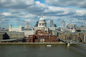
Tuesday, 1 February 2011
Tate- Britain Museum

1. I feel the logo of the Tate Britain is somewhat unimpressive. The "Tate" is consistent with the other Tate museum logos, which is necessary but this font and cartoon-like fading edges does not resemble any piece of the architecture (or collection). With such an interesting background and collection, I feel a lot more could be incorporated into the logo. A new color palate could really help, also, as this black and white doesn't relate to any of the colorful matter inside the museum. Furthermore, the museum has a large collection of modern artwork that I feel could be easily incorporated into the logo.


 3. The more modern art had simple, if any, display techniques. They were spread out to enhance the focal points of the pieces, and also to more adequately display the uniqueness of each piece. If they did contain frames, they were simple wood or iron frames that blended in with certain colors of the art. The large, intricute gold frames used for the Pre-Raphaelites were used as another layer in addition to the already present layers of the works. We learned that, when these paintings were hung in the homes of their original owners, there were layers behind them as well such as paints, wallpapers, furniture, etc. Also, the larger the frame on a piece of artwork, the more expensive it looks, which could have been appealing to the wealthier families when these types of paintings began to appear.
4. I was thorougly confused by "The Coral Reef". Once I entered the exhibit, I thought I was merely passing through some storage and back rooms of the museum, until I realized I was actually in the middle of the piece. It contained dingy lighting, odd furnishings, and creaky doors. I had to go back outside to re-read the descripition of the exhibit before I could try and understand how it related to art. In my opinion, I don't think this is art. There are certain artistic elements to the overall exhibit, but it's more an interior design reference than an artistic piece. Though it was confusing and, albeit, a little strange, there was still something intreguing about the Coral Reef exhibit; even if I can't decide what it is!
5. Though I enjoyed both museums, I think I enjoyed the Victoria and Albert Museum a bit more than the Tate Britain. The Victoria and Albert museum had some really impressive architecture, easy navigation, and some really awesome historical pieces. The Tate was interesting because it contained more modern art pieces- and some really remarkable architecture as well- but I feel that while in London, I'd prefer to see more historical European sculptures and artwork.
 6. I really enjoyed the exhibit on the Romantic art. Romantic art originated in second half of the 18th century in Europe, and many paintings from this movement were present in the Tate Britain. Many of the works were part of the J.M.W. Turner. When you first enter the exhibit, there is a large painting on the wall, describing Romantics, which contains the quote "I must create a system or be enslaved by another man's." This was integrated into the art of the time period in many different ways- there was more imagination and creativity in the paintings. The artists were using different line strokes and colors to convey more of their feelings into the paintings. I would love to return and have a chance to appreciate more of the paintings present in this collection.
Subscribe to:
Posts (Atom)