1. I feel the logo of the Tate Britain is somewhat unimpressive. The "Tate" is consistent with the other Tate museum logos, which is necessary but this font and cartoon-like fading edges does not resemble any piece of the architecture (or collection). With such an interesting background and collection, I feel a lot more could be incorporated into the logo. A new color palate could really help, also, as this black and white doesn't relate to any of the colorful matter inside the museum. Furthermore, the museum has a large collection of modern artwork that I feel could be easily incorporated into the logo.
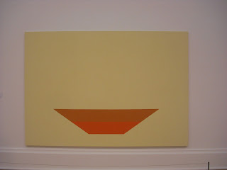
 3. The more modern art had simple, if any, display techniques. They were spread out to enhance the focal points of the pieces, and also to more adequately display the uniqueness of each piece. If they did contain frames, they were simple wood or iron frames that blended in with certain colors of the art. The large, intricute gold frames used for the Pre-Raphaelites were used as another layer in addition to the already present layers of the works. We learned that, when these paintings were hung in the homes of their original owners, there were layers behind them as well such as paints, wallpapers, furniture, etc. Also, the larger the frame on a piece of artwork, the more expensive it looks, which could have been appealing to the wealthier families when these types of paintings began to appear.
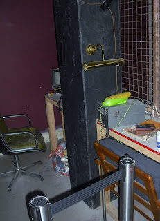
 4. I was thorougly confused by "The Coral Reef". Once I entered the exhibit, I thought I was merely passing through some storage and back rooms of the museum, until I realized I was actually in the middle of the piece. It contained dingy lighting, odd furnishings, and creaky doors. I had to go back outside to re-read the descripition of the exhibit before I could try and understand how it related to art. In my opinion, I don't think this is art. There are certain artistic elements to the overall exhibit, but it's more an interior design reference than an artistic piece. Though it was confusing and, albeit, a little strange, there was still something intreguing about the Coral Reef exhibit; even if I can't decide what it is!
5. Though I enjoyed both museums, I think I enjoyed the Victoria and Albert Museum a bit more than the Tate Britain. The Victoria and Albert museum had some really impressive architecture, easy navigation, and some really awesome historical pieces. The Tate was interesting because it contained more modern art pieces- and some really remarkable architecture as well- but I feel that while in London, I'd prefer to see more historical European sculptures and artwork.
 6. I really enjoyed the exhibit on the Romantic art. Romantic art originated in second half of the 18th century in Europe, and many paintings from this movement were present in the Tate Britain. Many of the works were part of the J.M.W. Turner. When you first enter the exhibit, there is a large painting on the wall, describing Romantics, which contains the quote "I must create a system or be enslaved by another man's." This was integrated into the art of the time period in many different ways- there was more imagination and creativity in the paintings. The artists were using different line strokes and colors to convey more of their feelings into the paintings. I would love to return and have a chance to appreciate more of the paintings present in this collection.


No comments:
Post a Comment